How to view the mobile version of a website on desktop
The shortcut that opens mobile view in every desktop browser, how to pick the right device, and where this view stops matching a real phone.
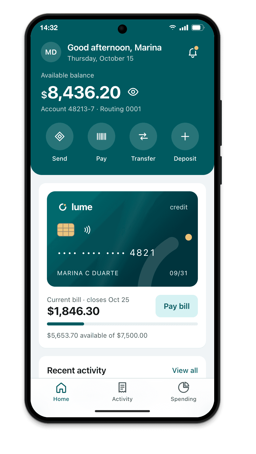
Short answer: open your browser’s developer tools and turn on the device toolbar. In Chrome and Edge that’s F12, then Ctrl+Shift+M on Windows, or ⌥⌘I, then ⇧⌘M on a Mac. The page shrinks to a phone-sized viewport, with a device menu at the top. No extension, nothing to install.
It answers the most common question in responsive work, “does my layout break on a narrow screen?”, in a couple of seconds. Below: the shortcut for each browser, the steps in Chrome, and the things this view leaves out.
The shortcut in each browser
| Browser | Windows | Mac |
|---|---|---|
| Chrome and Edge | F12, then Ctrl+Shift+M |
⌥⌘I, then ⇧⌘M |
| Firefox | Ctrl+Shift+M |
⌥⌘M |
| Safari | not available on Windows | ⌃⌘R |
Safari hides its version until you turn on the developer features: Safari › Settings › Advanced › Show features for web developers. After that, the Develop menu has Enter Responsive Design Mode.
Step by step in Chrome
- Open the site in Chrome. It can be the live address or your local dev server, like
localhost:5173. - Open DevTools with
F12on Windows or⌥⌘Ion a Mac. - Turn on the device toolbar with
Ctrl+Shift+Mor⇧⌘M. The page shrinks and a toolbar appears above it. - In the Dimensions menu, pick a device (iPhone, Pixel, Galaxy) or leave it on Responsive and drag the edges to any width.
- Reload after switching devices. Some sites read the user agent only on page load and keep serving the desktop version until you do.
To compare two widths quickly, the toolbar also takes exact numbers: type 390 and 844 in the width and height boxes and you have an iPhone-sized viewport without picking a model.
What desktop mobile view shows
- The viewport width and height of the chosen device, in CSS pixels.
- The device pixel ratio, so images and icons render at the right sharpness.
- Simulated touch: the cursor turns into a circle and scrolling behaves like a phone.
- The device’s user agent string, which some sites use to decide what to serve.
For most layout bugs (a column that won’t wrap, text that overflows, a menu that doesn’t fit), that’s all you need.
What it doesn’t show
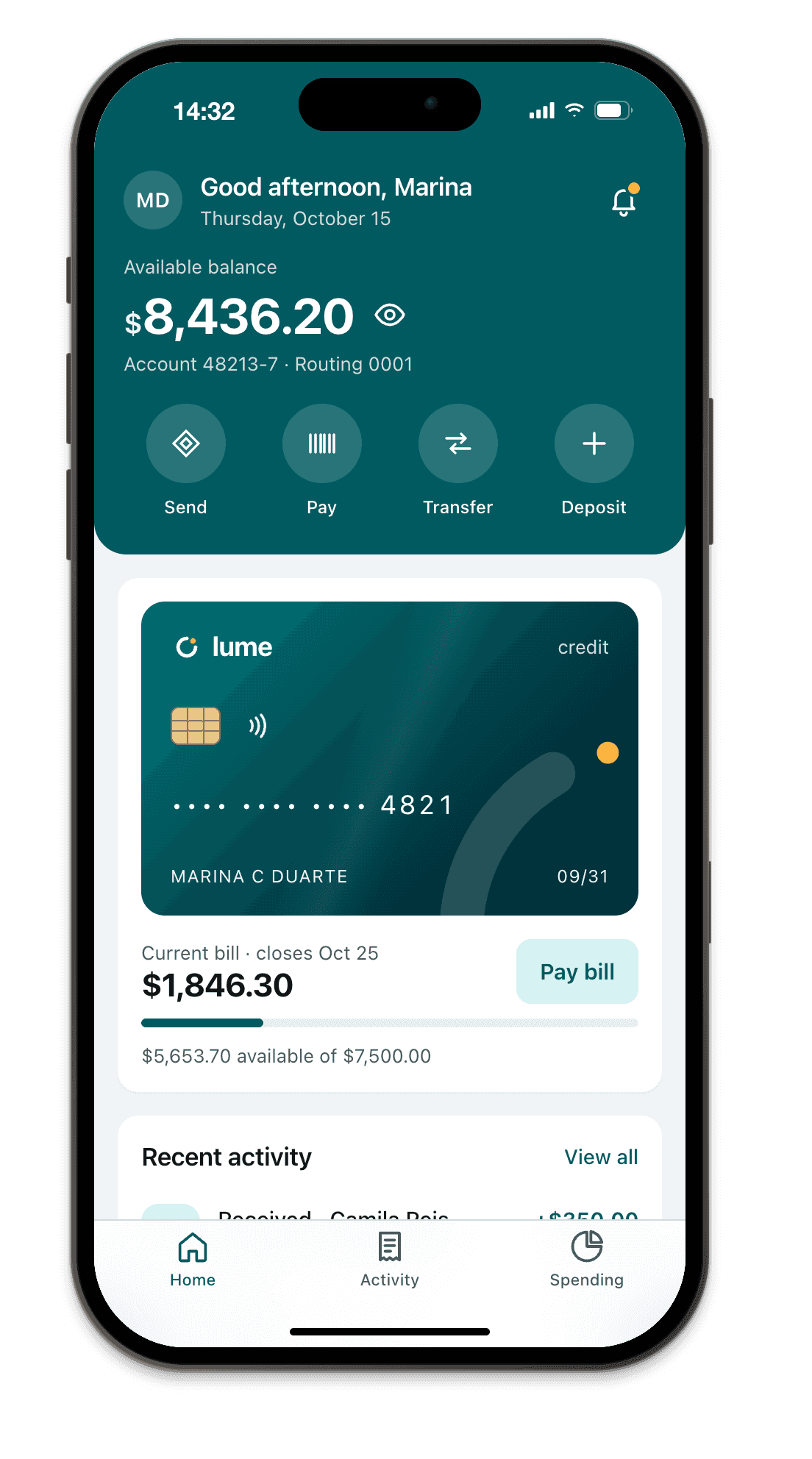
- The phone’s real screen. No frame, no status bar, no camera cutout. A header pinned to the top looks fine on desktop and sits under the Dynamic Island on an iPhone.
- Safe areas.
env(safe-area-inset-*)reads 0, so you can’t check whether the footer button hides behind the home indicator. The safe area guide covers why. - The Safari toolbar. On iPhone, Safari’s bottom bar takes space and changes size as you scroll, which is where
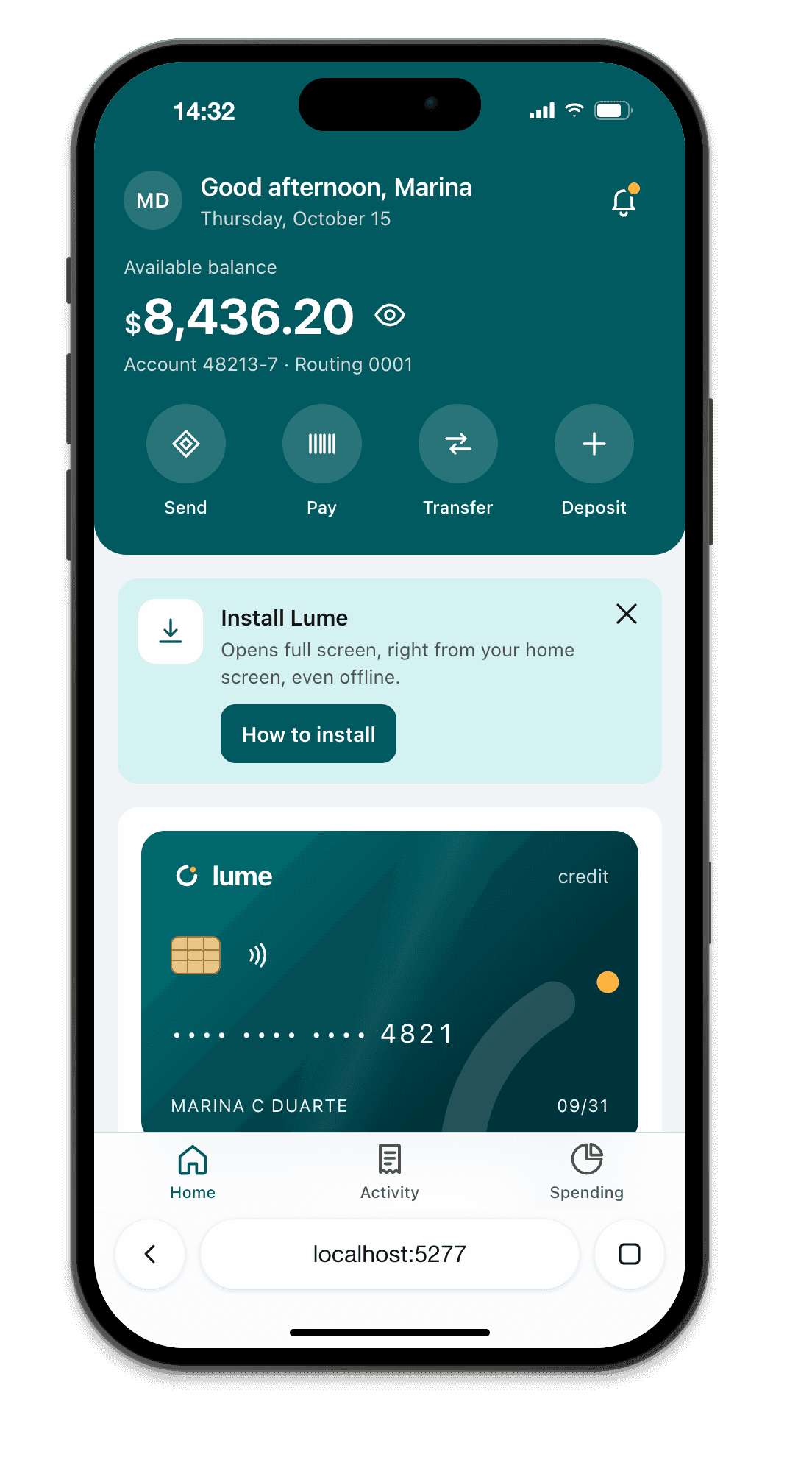
100vhgoes wrong. Desktop mobile view has no toolbar at all. More in 100vh in iPhone Safari. - The installed app. A PWA opened from the home screen loses the browser UI and matches
display-mode: standalone. Mobile view always shows the page inside a browser tab. - The phone’s engine. Chrome renders with Chrome’s engine whatever device you pick. Bugs that only happen in Safari on iPhone, which runs WebKit, won’t show up here.
- Your workflow. The view lives inside one tab and disappears when DevTools closes. With your editor full screen, checking a change means switching windows, reopening DevTools and switching back.
Check on a real phone over Wi-Fi
If your phone is on the same Wi-Fi network as your computer, it can open your local dev server:
- Start the server so it accepts network connections. Vite:
npm run dev -- --host. Next.js:next dev -H 0.0.0.0. - Look for the network address in the terminal, like
http://192.168.0.12:5173, and open it in the phone’s browser.
One catch: outside localhost, service workers need HTTPS, so a PWA won’t fully work this way. See how to test a PWA on iPhone for the workarounds.
When to use something else
Desktop mobile view is great for a quick look. It falls short when you want to keep an eye on the layout the whole time you code, check safe areas and the Safari toolbar, or see the installed app.
That’s the gap Breakpane fills: the device floats on top of your editor with the real frame, status bar and safe areas of each model, and refreshes when you save. For every option side by side, from extensions to Apple’s simulator, see mobile simulators for testing a website.