env(safe-area-inset-bottom) not working? Every cause and fix
A 30 second diagnosis, then each reason the inset comes back as 0 (or as the wrong number), with the fix and a snippet to read the real values on the device.
The 30 second diagnosis
- No
viewport-fit=cover? All insets are 0. Fix the viewport meta first (below). - Testing on desktop or in DevTools device mode? A rectangular screen has no safe area: 0 is the correct answer there.
- Top, left or right are 0 in portrait, in Safari? That’s expected: Safari’s own toolbar and status bar handle the notch in portrait.
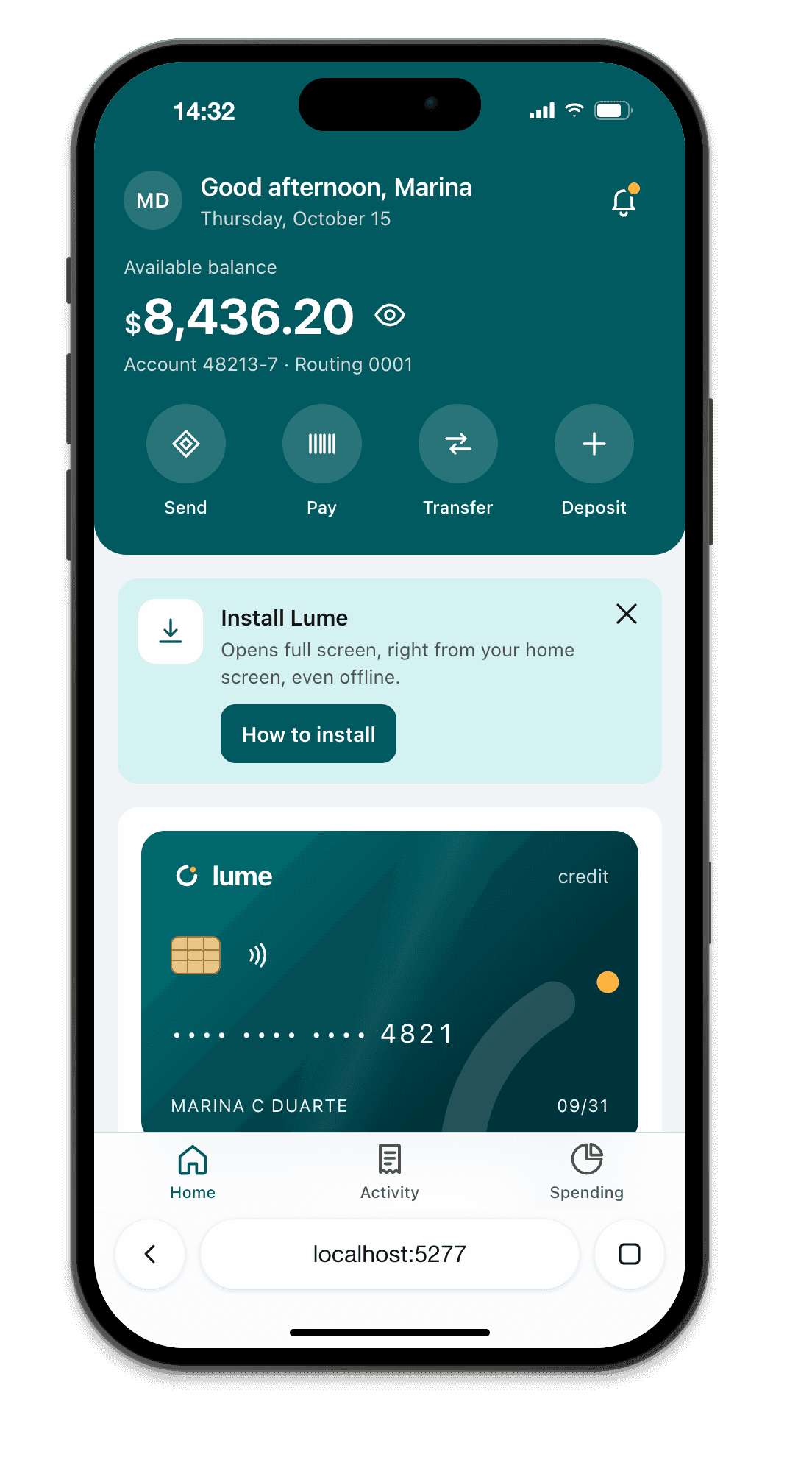
- Bottom is 0 or small in Safari, but 34 in the installed app? Also expected: in the browser, the toolbar sits between your page and the home indicator.
- Value correct but the element still hides behind the home indicator? The inset is on the wrong element, or
position: fixedis pinned withbottom: 0and no padding. - Reading it from JavaScript returns 0? Read a computed padding, not a custom property (snippet at the end).
1. Missing viewport-fit=cover (the cause most of the time)
By default (viewport-fit=auto) iOS keeps your layout inside the safe area and paints the strips around it with your background color. Your page never touches the notch, so every env(safe-area-inset-*) is 0. Opt in:
<meta name="viewport" content="width=device-width, initial-scale=1, viewport-fit=cover">
Then check there is only one viewport meta. Frameworks add their own, and a second tag without viewport-fit=cover can win. Run this in the console on the page:
[...document.querySelectorAll('meta[name=viewport]')].map((m) => m.content);
// expect exactly one entry, containing viewport-fit=cover
Setting it in common frameworks:
// Next.js App Router: app/layout.tsx
import type { Viewport } from 'next';
export const viewport: Viewport = { width: 'device-width', initialScale: 1, viewportFit: 'cover' };
// Nuxt: nuxt.config.ts
export default defineNuxtConfig({
  app: { head: { viewport: 'width=device-width, initial-scale=1, viewport-fit=cover' } },
});
In Vite, Astro or plain HTML, edit the meta in index.html or your layout. Remember that once you opt in, the page really does go under the notch, so headers and bottom bars need the padding below.
2. Safari’s toolbar is in the way
In Safari’s browser mode on iPhone, your page doesn’t touch the bottom of the screen while the toolbar is showing, so the bottom inset can be 0 or smaller than the device’s 34 px. The value can change as the toolbar expands and collapses, which is why hardcoding 34px is wrong in both directions.
iOS 26 adds a twist: in the default Compact layout, the tab bar floats over the page, and with viewport-fit=cover your content scrolls under it. Fixed bottom elements need the inset and a solid background (Safari 26 tints the toolbar from fixed elements near the bottom edge). The Safari 100vh guide covers the toolbar in detail.
Always give a floor with max(), so the bar still has breathing room when the inset is 0:
.tab-bar {
  position: fixed;
  inset-inline: 0;
  bottom: 0;
  padding-bottom: max(env(safe-area-inset-bottom), 12px);
  padding-left: env(safe-area-inset-left);
  padding-right: env(safe-area-inset-right);
  background: #111;
}
main { padding-bottom: calc(64px + env(safe-area-inset-bottom, 0px)); } /* content clears the bar */
3. Portrait vs landscape
In portrait, the insets that matter are top (status bar and Dynamic Island) and bottom (home indicator). In landscape the notch moves to a side: safe-area-inset-left or -right becomes around 50 to 62 px depending on the model, and the bottom inset drops to about 21 px. Layouts that only pad top and bottom look fine in portrait and put text under the notch when the phone turns.
.page {
  padding-left: max(env(safe-area-inset-left), 16px);
  padding-right: max(env(safe-area-inset-right), 16px);
}
4. Installed web app (standalone)
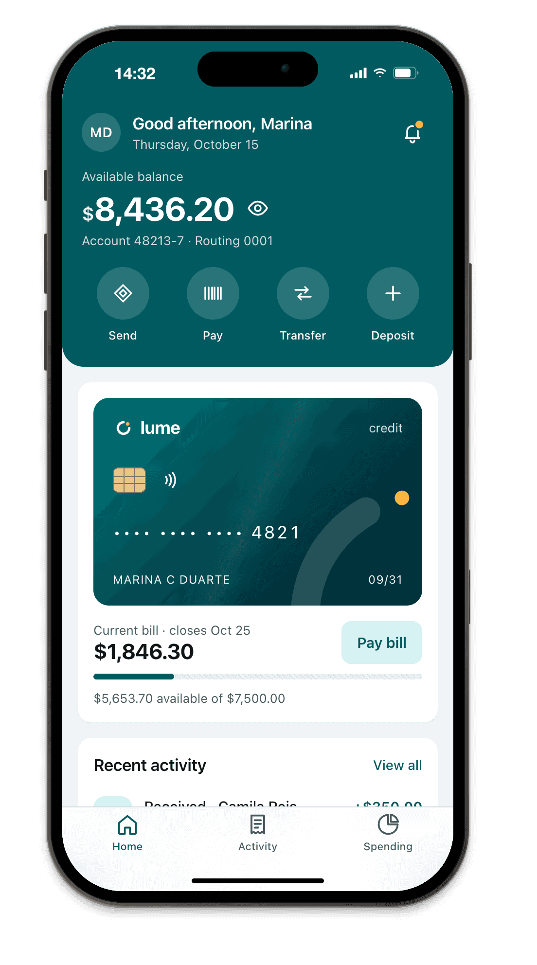
From the home screen there is no Safari toolbar, so the bottom inset is the full home indicator height and the top inset depends on the status bar style:
apple-mobile-web-app-status-bar-styledefault: the status bar is solid and your page starts below it, top inset 0.black-translucent: your page runs under the status bar andsafe-area-inset-topis the status bar height. Pad your header with it.
There is an old WebKit report (bug 236445) where standalone mode with viewport-fit=contain gives a bottom inset of 0 while the browser gives a value. Use cover and you avoid it.
5. Desktop and DevTools always return 0
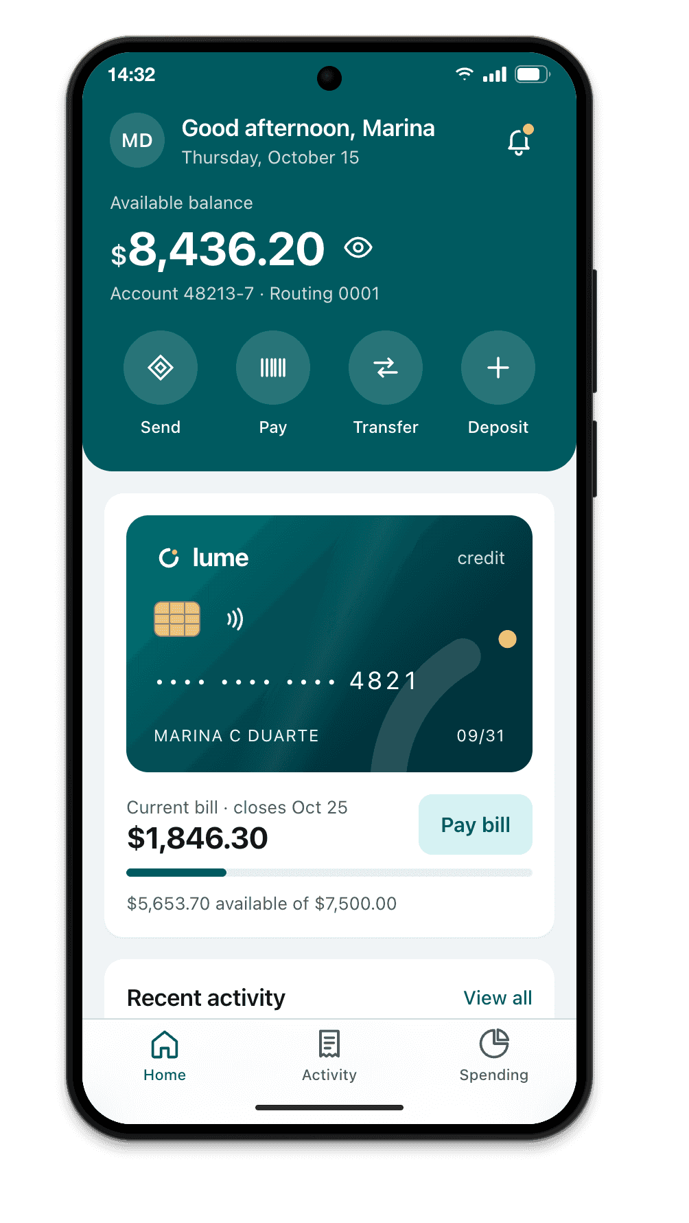
Chrome and Edge DevTools device mode set the viewport, pixel ratio and user agent, but not the safe area: every inset is 0, on every “iPhone”. Your layout can look perfect there and still sit under the Dynamic Island on a real phone.
To see real values without a phone you need something that emulates them. Chromium has a DevTools protocol command for it, Emulation.setSafeAreaInsetsOverride, which tools can call with each device’s numbers. Apple’s iOS Simulator on a Mac reports them too.
6. Android Chrome and edge-to-edge
Chrome on Android supports env(safe-area-inset-*). Since Chrome 135 on Android 15, the page can draw edge to edge under the gesture bar:
- Without
viewport-fit=cover, Chrome reserves a strip at the bottom and the inset stays 0. - With
cover, the page extends under the gesture bar andsafe-area-inset-bottomreports its height. The value can change as Chrome’s bottom bar moves.
Chrome also added safe-area-max-inset-bottom, the largest the inset will get. The Chrome team recommends padding with the max value and offsetting with the difference, so the element doesn’t relayout on every scroll:
.bar {
  padding-bottom: env(safe-area-max-inset-bottom, 36px);
  bottom: calc(env(safe-area-inset-bottom, 0px) - env(safe-area-max-inset-bottom, 36px));
}
7. Syntax mistakes that look like “not working”
constant(safe-area-inset-bottom)was iOS 11.0 and 11.1 only. Delete it.- Typos are silent.
env(safe-area-inset-botom)without a fallback makes the whole declaration fall back to the property’s initial value. Add a fallback while debugging:env(safe-area-inset-bottom, 0px). - Don’t put
env()in a media query. The spec allows it, browsers don’t rely on it. - Iframes: don’t count on the inset inside an embedded frame. Pad the parent page instead.
Read the real values on the device
Since iOS 17.5, reading a custom property like --sab: env(safe-area-inset-bottom) with getPropertyValue can return 0. Read a computed padding instead:
const probe = document.createElement('div');
probe.style.cssText =
  'position:fixed;visibility:hidden;padding:env(safe-area-inset-top) env(safe-area-inset-right) env(safe-area-inset-bottom) env(safe-area-inset-left)';
document.body.append(probe);
const s = getComputedStyle(probe);
console.table({ top: s.paddingTop, right: s.paddingRight, bottom: s.paddingBottom, left: s.paddingLeft });
probe.remove();
Run it in Safari, then in the installed app, then in landscape. Three contexts, three different sets of values: that’s normal.
Test with real insets while you code
Breakpane gives each framed iPhone and Android its real safe area values through that Chromium override, on Windows and macOS: Dynamic Island or notch, home indicator, landscape side insets, Safari or Chrome toolbar in browser mode and the installed app mode with your status bar style. It reads your viewport-fit like iOS does, so a missing cover gives you zeros there too. Coding agents can run its responsive audit, which flags content under the unsafe area. It’s Chromium, not WebKit: confirm the final result on a real device.