Safari 100vh bug: the address bar, dvh, svh and lvh (iOS 26)
Why 100vh overflows on iPhone, the three viewport units that replace it, which one to pick for each layout, and the iOS 26 toolbar details nobody has written down yet.
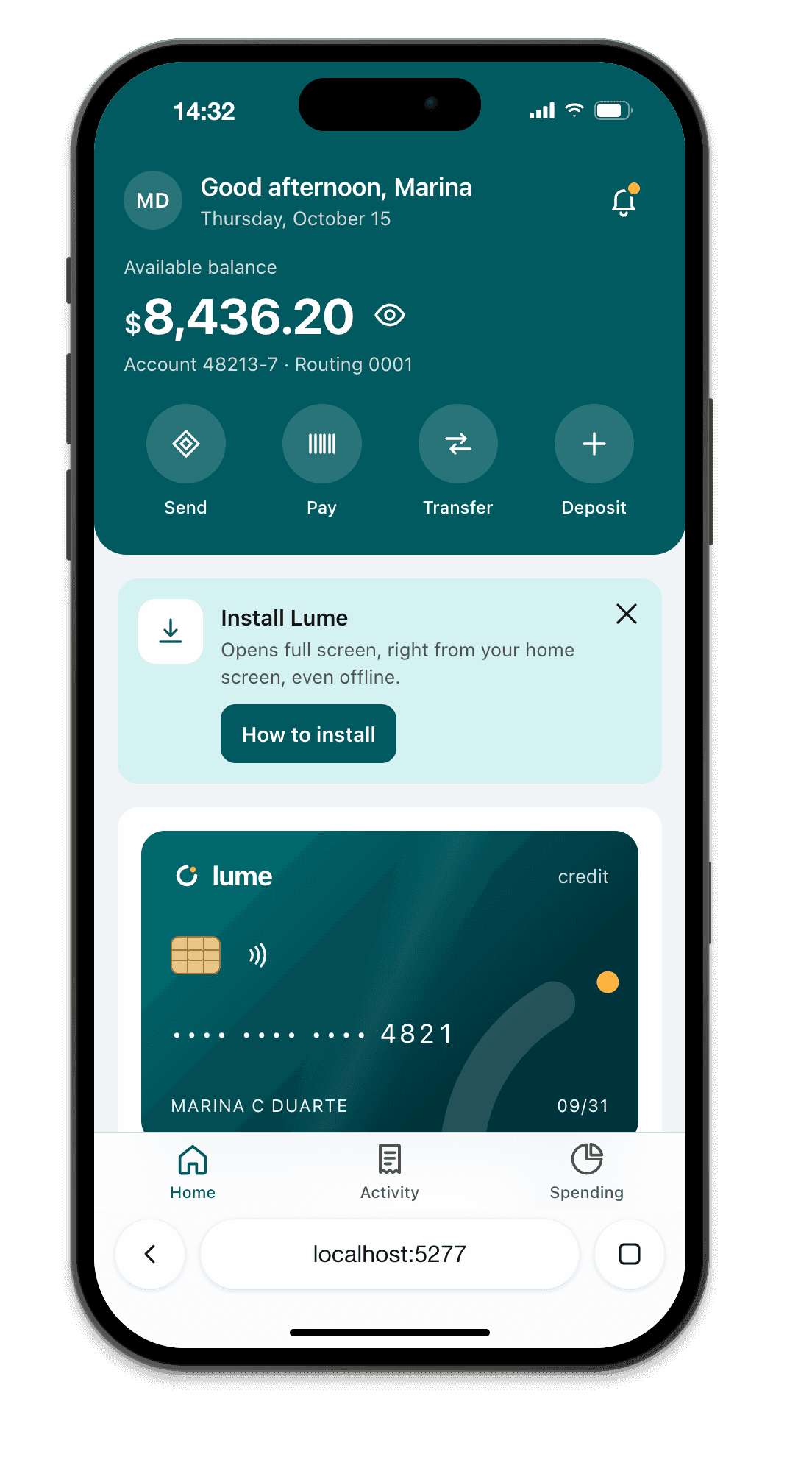
Short answer: in Safari on iPhone, 100vh is the height of the screen with the toolbar hidden. When the page loads, the toolbar is showing, so a 100vh block is taller than what you see and its bottom ends up behind the bar. Use 100svh for things that must fit on the first screen, 100dvh only for app shells that should follow the toolbar, and keep 100vh as the fallback line.
.hero {
  min-height: 100vh;  /* fallback for browsers before 2022 */
  min-height: 100svh; /* fits with the toolbar showing */
}
That’s not a bug Apple will fix. The WebKit report about it has been open since 2015, and the behavior is now written into the CSS spec.
Why 100vh is taller than the screen
Mobile browsers have three heights for the same screen:
- Small viewport (
svh): the toolbar is fully showing. This is what you see when the page first loads. - Large viewport (
lvh): the toolbar has collapsed after you scroll down. - Dynamic viewport (
dvh): whichever of the two is true right now, changing as the toolbar moves.
The CSS Values 4 spec says plain vh maps to the large viewport, for web compatibility. Safari does that, and so does Chrome on Android. So 100vh = 100lvh, which is taller than the screen you actually see at load time.
On an iPhone 16 Pro or 17 Pro in iOS 26, with the default Compact tab layout, window.innerHeight measures 718 px with the toolbar expanded and 754 px collapsed. A 100vh hero is roughly 36 px taller than what’s visible on load, which is exactly enough to hide a “scroll down” arrow or a bottom button.
Which unit to use
| Layout | Use | Why |
|---|---|---|
| Hero, landing first screen, splash | min-height: 100svh |
Always fits with the toolbar showing; never resizes while scrolling |
| Full-screen background image | 100lvh |
Covers the screen even when the toolbar collapses, no gap |
| App shell, chat, map with a fixed composer | height: 100dvh |
Follows the toolbar so the bottom row stays visible |
| Full-screen overlay or modal | position: fixed; inset: 0 |
Matches the visible area without any unit |
| Long scrolling page | Avoid dvh |
Its height changes while the user scrolls, causing reflows and jank |
Support for svh, lvh and dvh covers Safari 15.4+, Chrome and Edge 108+, Firefox 101+ and Samsung Internet 21+, about 96% of users. Writing 100vh first and the new unit second is enough of a fallback; @supports is optional.
.app {
  height: 100vh;
  height: 100dvh;
  display: grid;
  grid-template-rows: auto 1fr auto; /* header, scroll area, composer */
}
.app main { overflow-y: auto; }
Stop using the old hacks
height: -webkit-fill-availableonly worked in WebKit, breaks in Chrome, and has not been needed since Safari 15.4 (March 2022).- The JS
--vhtrick (document.documentElement.style.setProperty('--vh', innerHeight * 0.01 + 'px')on resize) was the fix for Safari before 15.4. Today it’s slower and less accurate thansvhordvh. Remove it unless you still support iOS 15.3 or older.
What changed in iOS 26
iOS 26 brought the Liquid Glass design to Safari: in the default Compact layout, the tab bar floats at the bottom and the page scrolls underneath it. A few things follow from that.
- Content can sit under the toolbar. With
viewport-fit=coverin your viewport meta, the page extends under the glass bar. Give fixed bottom elementspadding-bottom: env(safe-area-inset-bottom)or the bar covers them. theme-colorno longer tints the bar. Safari 26 tints the toolbar from your page: thehtml/bodybackground and fixed or sticky elements near the top and bottom edges. Set an explicithtml { background: … }, and hide closed overlays withdisplay: none(anopacity: 0overlay still tints the bar).- Early 26.x bugs were fixed. Safari 26.1 fixed a gap at the bottom of layouts with viewport-sized fixed containers; 26.2 made full-screen
<dialog>backdrops extend below the address bar and stopped edge-pinned fixed elements from vanishing during rubber-band scrolling. If you added workarounds in September 2025, retest them.
A fixed bottom bar that works with both the toolbar and the home indicator:
<meta name="viewport" content="width=device-width, initial-scale=1, viewport-fit=cover">
html { background: #fff; }
.tab-bar {
  position: fixed;
  inset-inline: 0;
  bottom: 0;
  padding-bottom: max(env(safe-area-inset-bottom), 12px);
  background: #fff; /* solid: also what Safari 26 samples for the tint */
}
More on insets in why safe-area-inset-bottom is not working.
The keyboard doesn’t change dvh
People expect 100dvh to shrink when the on-screen keyboard opens. It doesn’t, on iOS or on Chrome for Android since version 108: the keyboard only resizes the visual viewport, and viewport units stay the same. To keep a composer above the keyboard, listen to visualViewport:
const vv = window.visualViewport;
const update = () => {
  const keyboard = Math.max(0, innerHeight - vv.height - vv.offsetTop);
  document.documentElement.style.setProperty('--keyboard', keyboard + 'px');
};
vv.addEventListener('resize', update);
vv.addEventListener('scroll', update);
.composer { bottom: var(--keyboard, 0px); }
On Android you can opt back into the old behavior with interactive-widget=resizes-content in the viewport meta. Safari ignores that key.
How to test it
- Real iPhone: the only way to see the toolbar collapse, the keyboard and the rubber band. Load the page, check the first screen, scroll down a little, check again, then focus an input.
- DevTools device mode: shows a fixed viewport with no toolbar, so
100vh,svhanddvhare all equal. It can’t show this bug. - Breakpane: draws the iOS 26 Safari toolbar (and Chrome’s on Android) around a viewport the size Safari reports with the toolbar expanded, on Windows or macOS. That’s the check for the result: does your first screen fit, and is anything hidden behind the bar or the home indicator. The toolbar doesn’t collapse and it renders with Chromium, so
vh,svhanddvhare equal there and it won’t reproduce the overflow itself. Do the scroll and keyboard pass on a real iPhone.