iPhone simulator for Windows? How to test a website on iPhone without a Mac
There is no iPhone simulator for Windows. What you can check on a PC, what only real Safari shows, and the cheapest way to reach each one.
Short answer: you can’t run Apple’s iPhone simulator on Windows. It ships with Xcode, and Xcode only runs on macOS. What you can do on a PC is split the problem in two: check the iPhone layout locally (free, instant) and check the Safari engine only when you need to (Playwright WebKit for free, a real iPhone in the cloud for the final pass).
Most “iPhone simulator for Windows” lists still recommend iPadian, Air iPhone or Ripple. None of them help with web testing. iPadian is a themed launcher that looks like iOS, Air iPhone is an old Adobe AIR skin, and Ripple was discontinued years ago. They render your site with whatever engine they bundle, at whatever size they like. Skip them.
Two different questions: layout and engine
When someone says “it’s broken on my iPhone”, the bug is usually one of these:
- Layout bugs. They depend on the screen: a 393 px wide viewport, a 3x pixel density, the Dynamic Island, the Safari toolbar taking space at the bottom, safe areas, the installed web app with no toolbar at all. Any browser that reproduces those numbers will show them.
- Engine bugs. They depend on WebKit, the engine every browser on iPhone uses (Chrome and Firefox on iOS included). A CSS feature Safari draws differently, a date string
new Date('01-15-2026')that parses in Chrome and returnsInvalid Datein Safari, a regex orIntldifference. - Device behavior. It depends on iOS itself: the on-screen keyboard pushing fixed elements, auto zoom on inputs with a font size under 16 px, the toolbar collapsing as you scroll, rubber band scrolling. Only a real iPhone (or Apple’s simulator) shows these.
In practice most client reports are the first kind, and those you can fix on Windows today.
What each option actually tests
| Option | Runs on Windows | Layout (viewport, DPR, safe areas) | WebKit engine | iOS behavior (keyboard, toolbar) | Cost |
|---|---|---|---|---|---|
| Chrome/Edge device mode | Yes | Viewport and DPR only | No | No | Free |
| Breakpane | Yes | Yes, with frame, Safari toolbar and safe areas | No | No | 14 day trial, then paid |
| Playwright WebKit | Yes | Viewport and DPR | Close (open source WebKit, not Safari) | No | Free |
| Cloud iPhones (BrowserStack, LambdaTest, Sauce Labs) | In the browser | Yes | Yes, real Safari | Yes | Paid, short free trials |
| Appetize.io | In the browser | Yes | Yes, Apple’s simulator | Mostly | Small free tier, then paid |
| A real iPhone over Wi-Fi | Yes | Yes | Yes | Yes | The iPhone |
| Rented Mac (MacinCloud, AWS EC2 Mac) | Remote desktop | Yes, via Xcode Simulator | Yes | Mostly | Hourly or monthly; AWS bills 24 h minimum |
Prices change often; check each vendor’s page before you commit.
1. Check the iPhone layout for free: DevTools device mode
In Chrome or Edge on Windows, press F12, then Ctrl+Shift+M, and pick an iPhone from the device list. You get the right viewport width, the device pixel ratio and an iPhone user agent, which is enough to catch overflow, broken grids and tiny tap targets.
What it doesn’t give you: the safe areas are always 0, there is no Safari toolbar eating the bottom of the screen, and there is no installed web app mode. Make sure your page is set up for the notch first, or device mode will hide the problem:
<meta name="viewport" content="width=device-width, initial-scale=1, viewport-fit=cover">
.app-header { padding-top: env(safe-area-inset-top); }
.tab-bar { padding-bottom: max(env(safe-area-inset-bottom), 12px); }
If those insets seem to do nothing, see why safe-area-inset-bottom is not working.
2. Catch Safari engine bugs without a Mac: Playwright WebKit
Playwright ships its own build of WebKit that runs on Windows. It isn’t Safari (no Safari UI, different fonts, some media gaps), but it’s the same engine family, so it catches most “works in Chrome, breaks in Safari” CSS and JavaScript bugs.
Open your local site in WebKit with an iPhone profile, no test code needed:
npx playwright install webkit
npx playwright open --device="iPhone 15" http://localhost:5173
Or make it part of your test run:
// playwright.config.ts
import { defineConfig, devices } from '@playwright/test';

export default defineConfig({
  use: { baseURL: 'http://localhost:5173' },
  projects: [
    { name: 'iphone-webkit', use: { ...devices['iPhone 15'] } },
    { name: 'android-chrome', use: { ...devices['Pixel 7'] } },
  ],
});
The iPhone 15 profile sets WebKit, the viewport, the pixel ratio, touch and the user agent. It doesn’t simulate the toolbar or the keyboard.
3. Real Safari without a Mac
Cloud iPhones. BrowserStack Live, LambdaTest and Sauce Labs stream real iPhones to your browser. You open your deployed site, or your local server through their tunnel app, and use the real Safari. This is the closest you get to a client’s phone without owning one. They are paid, with short trials, so they work best as a final check before a release rather than a daily tool.
Appetize.io streams Apple’s iOS Simulator to the browser. It’s built for native apps, but Safari runs inside it too.
A rented Mac. MacinCloud or an AWS EC2 Mac instance gives you a full macOS desktop with Xcode, the Simulator and Safari’s Web Inspector. AWS has a 24 hour minimum per Mac host because of Apple’s license, so a quick test still costs a full day.
4. If you have an iPhone but no Mac
Open your dev server on the phone over Wi-Fi. Both devices must be on the same network:
# Vite
npm run dev -- --host
# Next.js
npx next dev -H 0.0.0.0
Then open http://192.168.0.12:5173 (your PC’s IP, from ipconfig) in Safari on the iPhone. If it doesn’t load, Windows Firewall is usually blocking Node: allow it on private networks.
Inspecting that page from Windows is the hard part, because Apple’s Web Inspector lives in Safari for Mac. inspect.dev does it on Windows (paid, with a limited free tier). The open source ios-webkit-debug-proxy still exists but setup on Windows is fiddly, and remotedebug-ios-webkit-adapter no longer works with current iOS versions.
Does Chrome on iPhone change anything?
No. Chrome, Edge and Firefox on iPhone use WebKit under the hood, like Safari. Apple allows other engines only in the EU (since iOS 17.4) and Japan, and as of late 2026 no major browser ships one to the public. Testing “Chrome on iPhone” is testing WebKit with a different toolbar.
A workflow that holds up
- While you code: check iPhone and Android layouts locally, with the real viewport, toolbar and safe areas.
- Before you merge: run the Playwright WebKit project to catch engine bugs.
- Before you ship: one pass on a real iPhone, in the cloud or in your hand, for the keyboard, the collapsing toolbar and anything that feels off.
Where Breakpane fits
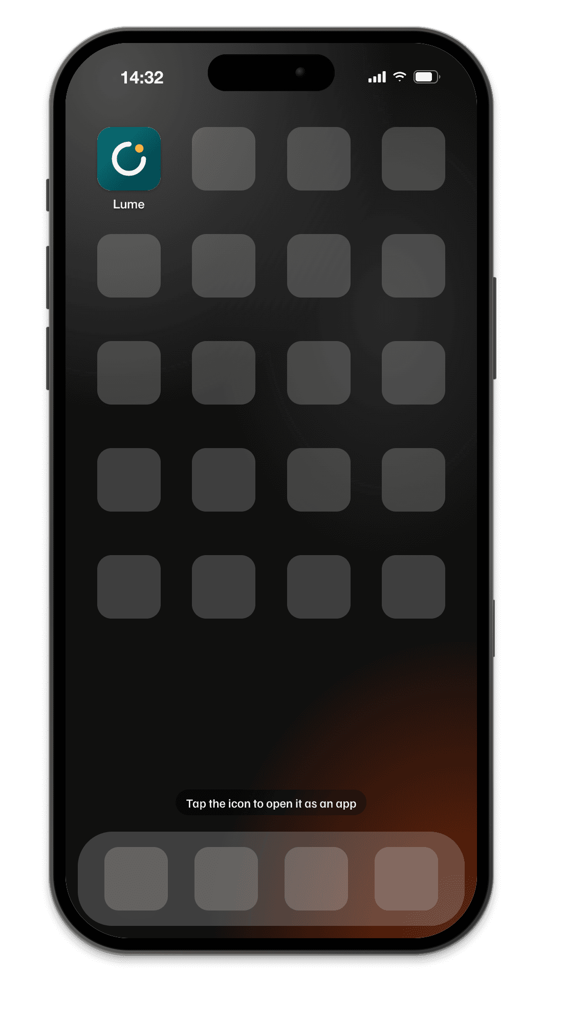
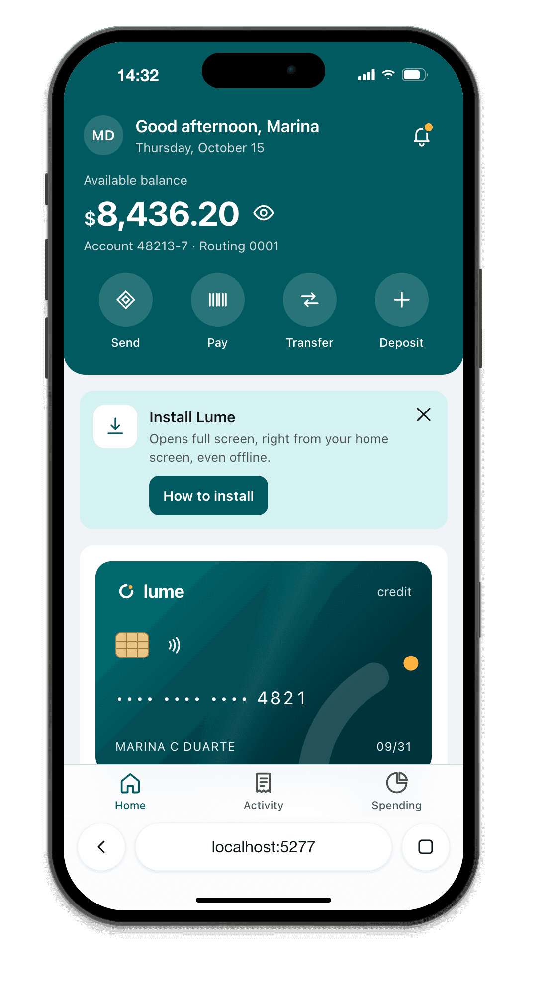
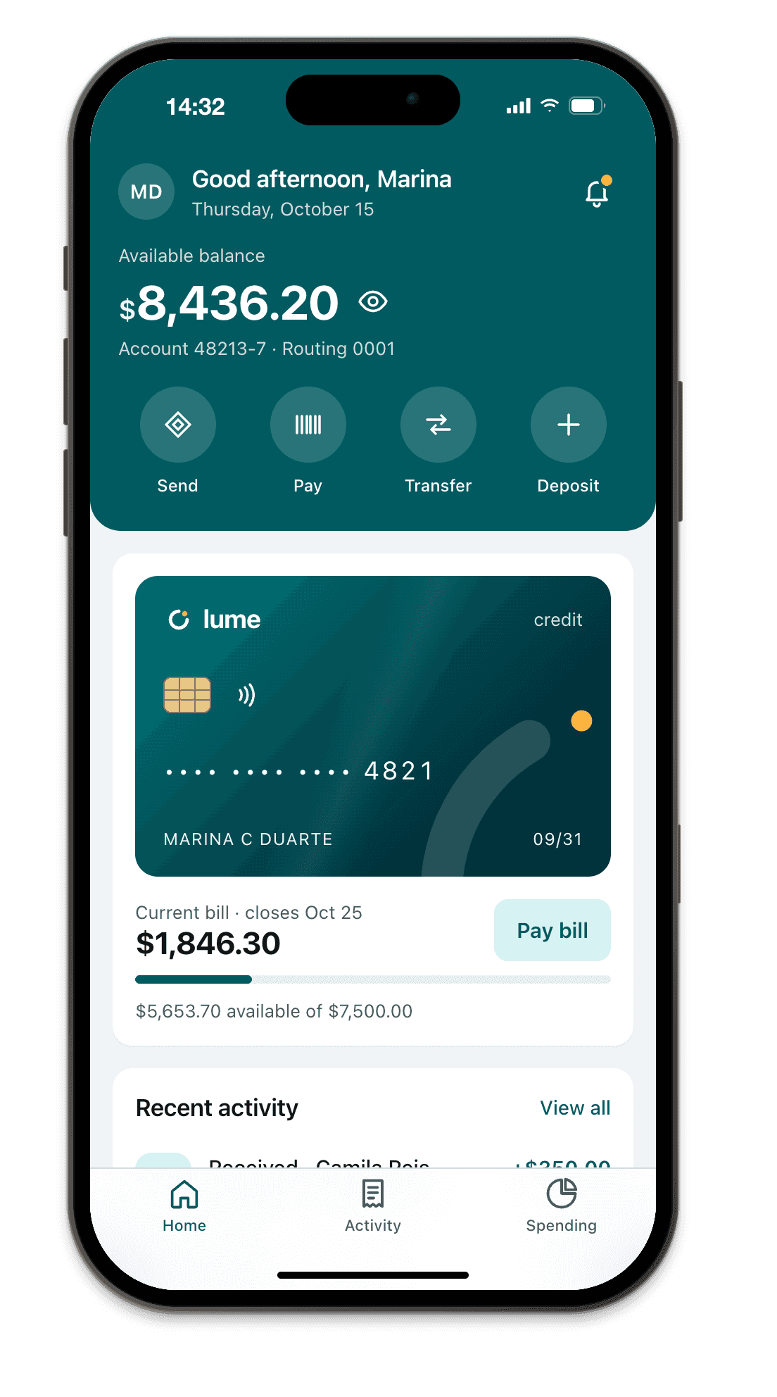
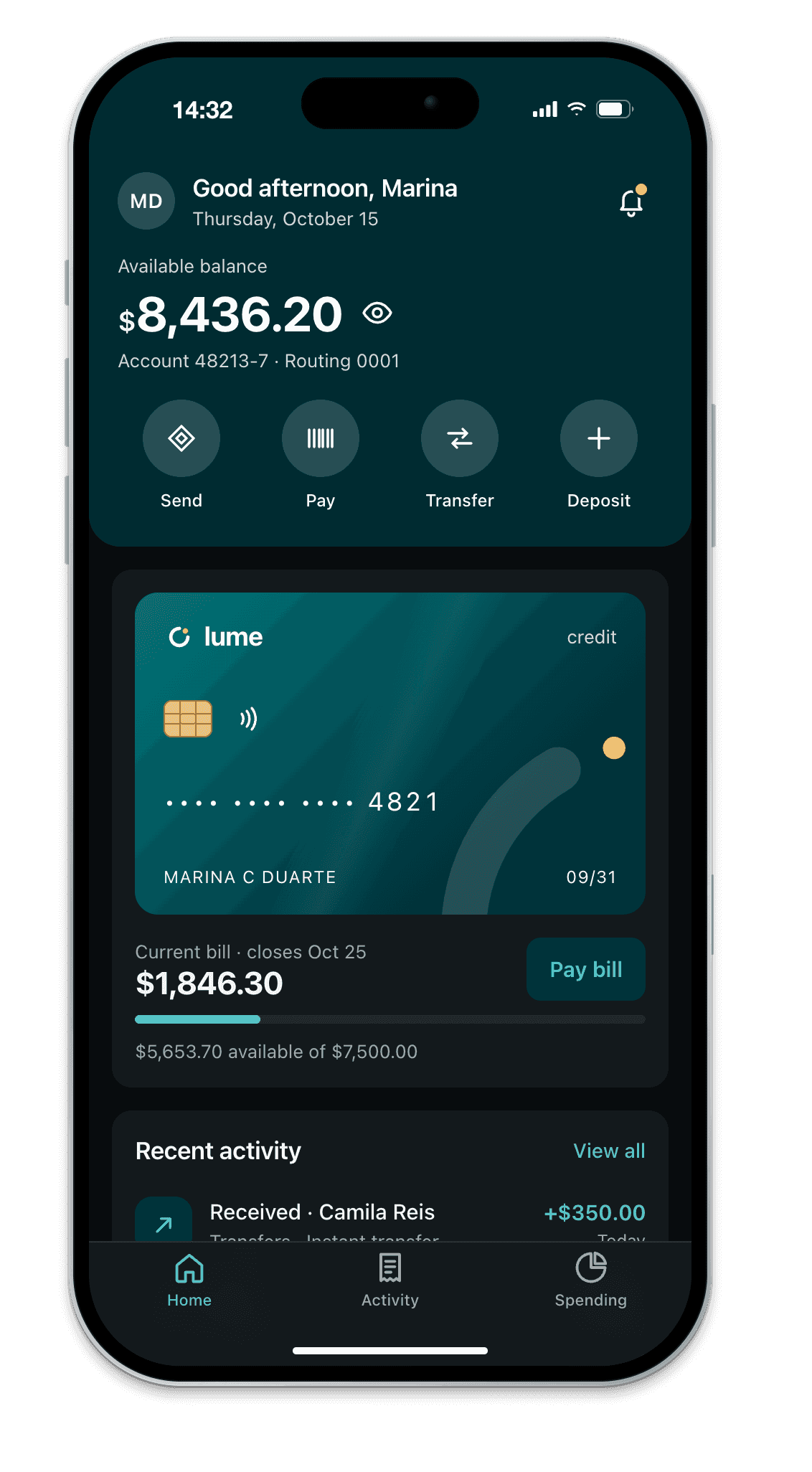
Step 1 is what Breakpane is for. It runs on Windows and macOS and keeps an iPhone, Android, iPad or laptop floating over your editor, showing your localhost at each model’s real size: the Dynamic Island or notch, the Safari or Chrome toolbar, the safe area values of that device and the installed web app mode. It reloads when you save. Coding agents can drive the same devices through its built-in MCP server.
It renders with Chromium, not WebKit. It fixes the layout side; for engine bugs and iOS behavior, use steps 2 and 3.