Mobile simulators for testing a website: every option on PC and Mac
Seven ways to see your site the way a phone does, from the fastest to the most faithful, and what each one is good for.
“Mobile simulator” covers tools that have very little in common. Some only shrink the page to a phone-sized box; others boot a whole phone operating system. They answer different questions, so the useful thing is knowing which one you need right now. Below, every option that exists today, what it does well and where it stops.
A note on terms: an emulator reproduces the device’s hardware and runs its real operating system (the Android Emulator does this). A simulator reproduces the software on your computer’s own hardware (Apple’s iOS Simulator does this). For testing a website the difference matters less than one question: does the tool run the phone’s real browser engine, or your desktop browser at a smaller size?
Quick summary
| Option | Runs on | Cost | Best for |
|---|---|---|---|
| Browser mobile view | Windows and Mac | Free | A quick layout check |
| Browser extensions | Windows and Mac | Free or paid | Seeing the page inside a phone frame |
| Xcode Simulator | Mac only | Free | Real Safari, WebKit bugs |
| Android Emulator | Windows, Mac, Linux | Free | Real Chrome for Android |
| Cloud devices | Any browser | Paid | Final checks on many models |
| A real phone | Anything | The phone | Real touch, performance and keyboard |
| Breakpane | Windows and Mac | 14 day trial, then paid | Watching the layout while you code |
1. Browser mobile view
Chrome, Edge, Firefox and Safari can all switch a page to a phone’s viewport, pixel density and user agent. One shortcut (Ctrl+Shift+M in Chrome on Windows, after F12), nothing to install.
- Good for: checking whether the layout breaks on a narrow screen.
- Stops at: no frame, no safe areas, no Safari toolbar, no installed app. It lives inside one tab and disappears when DevTools closes.
Shortcuts for every browser are in how to view the mobile version of a website on desktop.
2. Browser extensions
Several extensions open the page inside an iPhone or Android frame, and some show several sizes side by side.
- Good for: showing the page with a phone look, including to a client.
- Stops at: many load your page inside an iframe on their own page. Sites that block framing (
X-Frame-Optionsorframe-ancestors) won’t load, and installed-app behavior doesn’t exist.
3. Xcode Simulator
Apple’s Xcode includes an iPhone and iPad simulator running real iOS and real Safari. It’s the most faithful way to see WebKit without owning an iPhone, and Safari on your Mac can inspect it through the Develop menu.
- Good for: Safari-only bugs, like zoom when focusing an input under 16 px, date parsing, or scroll differences.
- Stops at: Mac only, several gigabytes to download, and a separate heavy window you won’t keep open all day. On Windows, see testing on iPhone without a Mac.
4. Android Emulator
The emulator in Android Studio runs a full Android system with Chrome for Android. It works on Windows, Mac and Linux, and desktop Chrome can inspect it at chrome://inspect.
- Good for: Chrome for Android, the on-screen keyboard and system behavior.
- Stops at: needs a lot of memory and hardware virtualization turned on, and takes a while to boot.
5. Cloud devices
Services like BrowserStack, LambdaTest and Sauce Labs let you drive real phones over the internet, across dozens of models.
- Good for: the final pass before release, on devices you don’t own.
- Stops at: paid after short trials, network lag between your click and the screen, and awkward to use while you’re still building.
6. A real phone
Nothing replaces the device in your hand for touch, performance and the keyboard. With your dev server open to the network (npm run dev -- --host in Vite), the phone can load the project from your computer’s IP address.
- Good for: how the site really feels.
- Stops at: every change means picking up the phone, unlocking it and reloading. And you only have the phones you have.
7. Breakpane
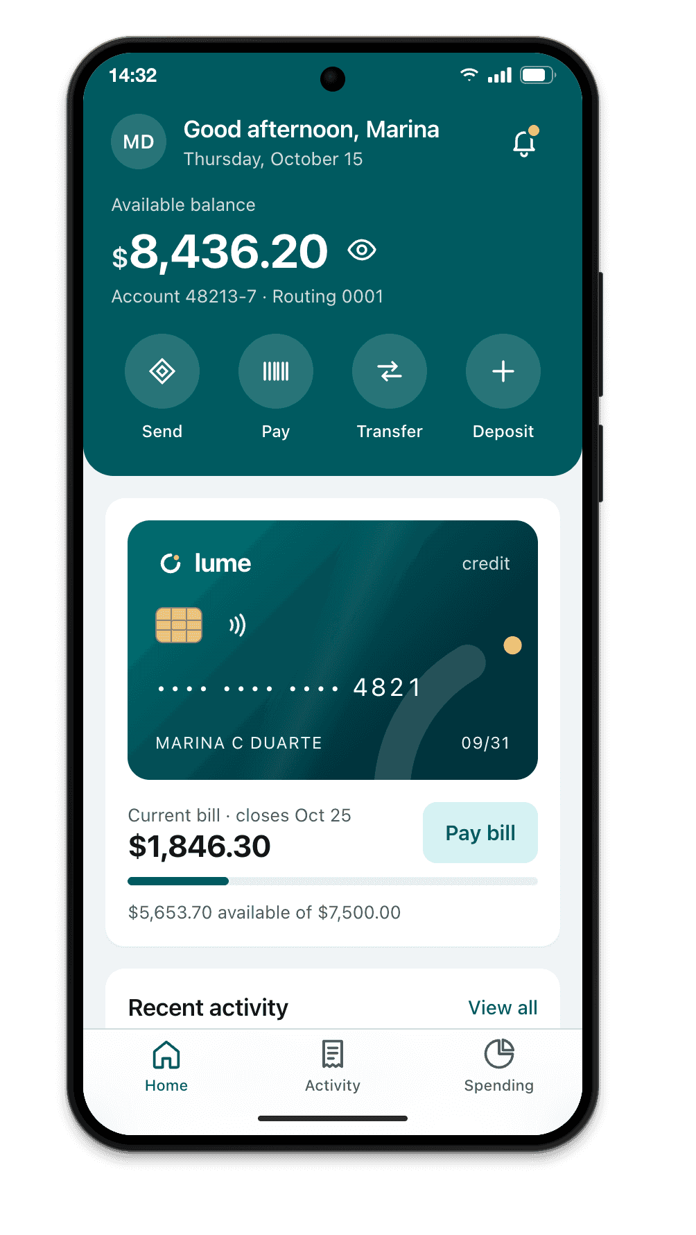
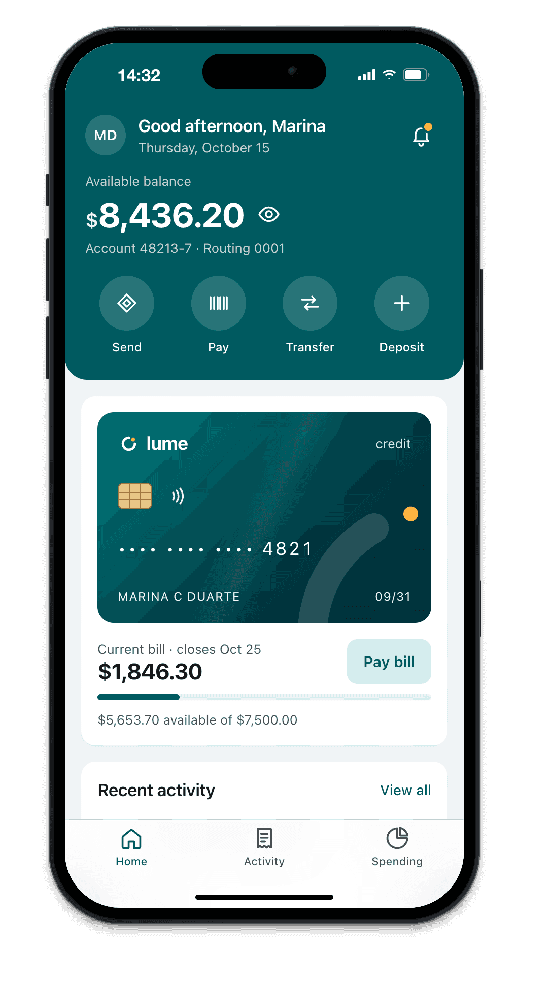
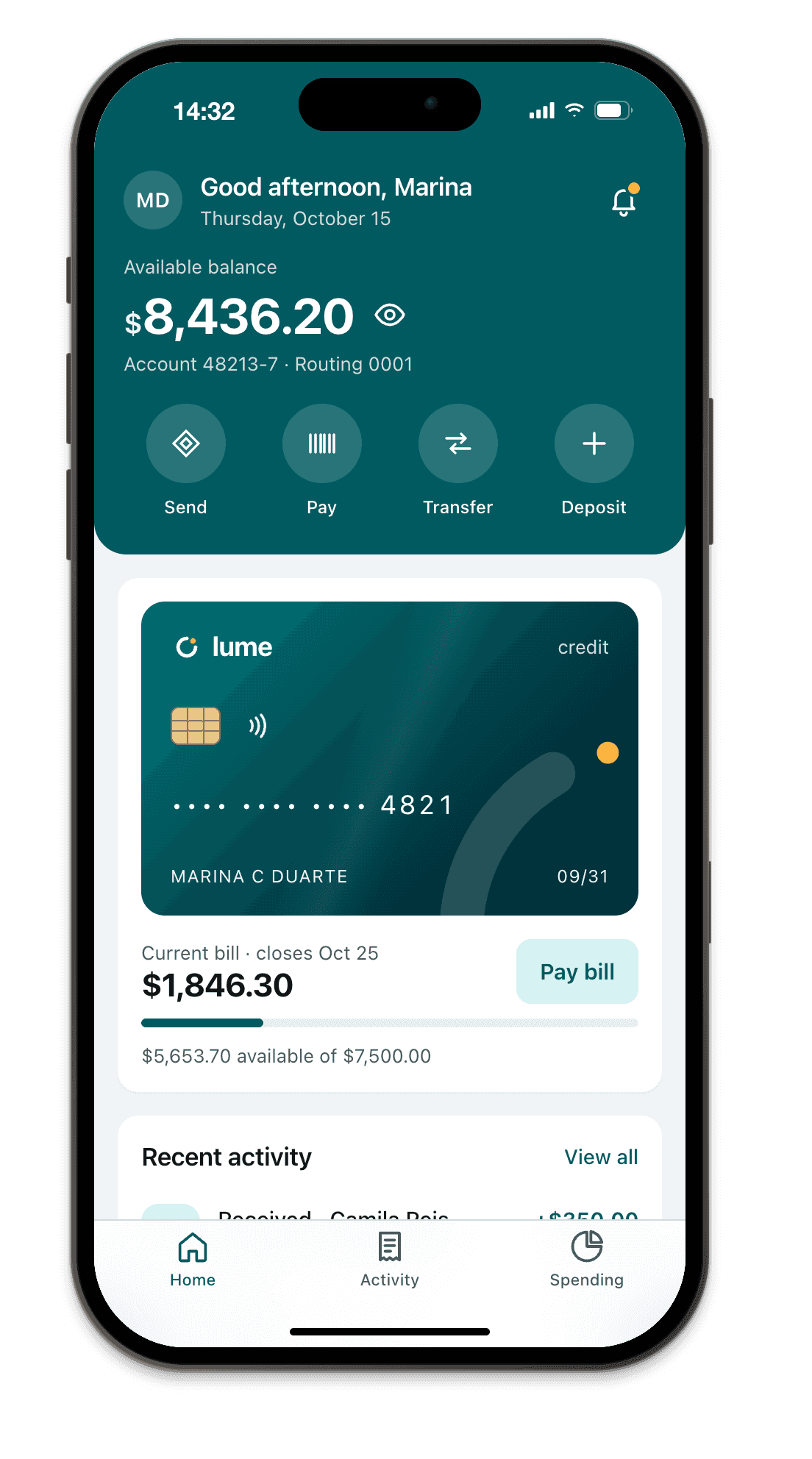
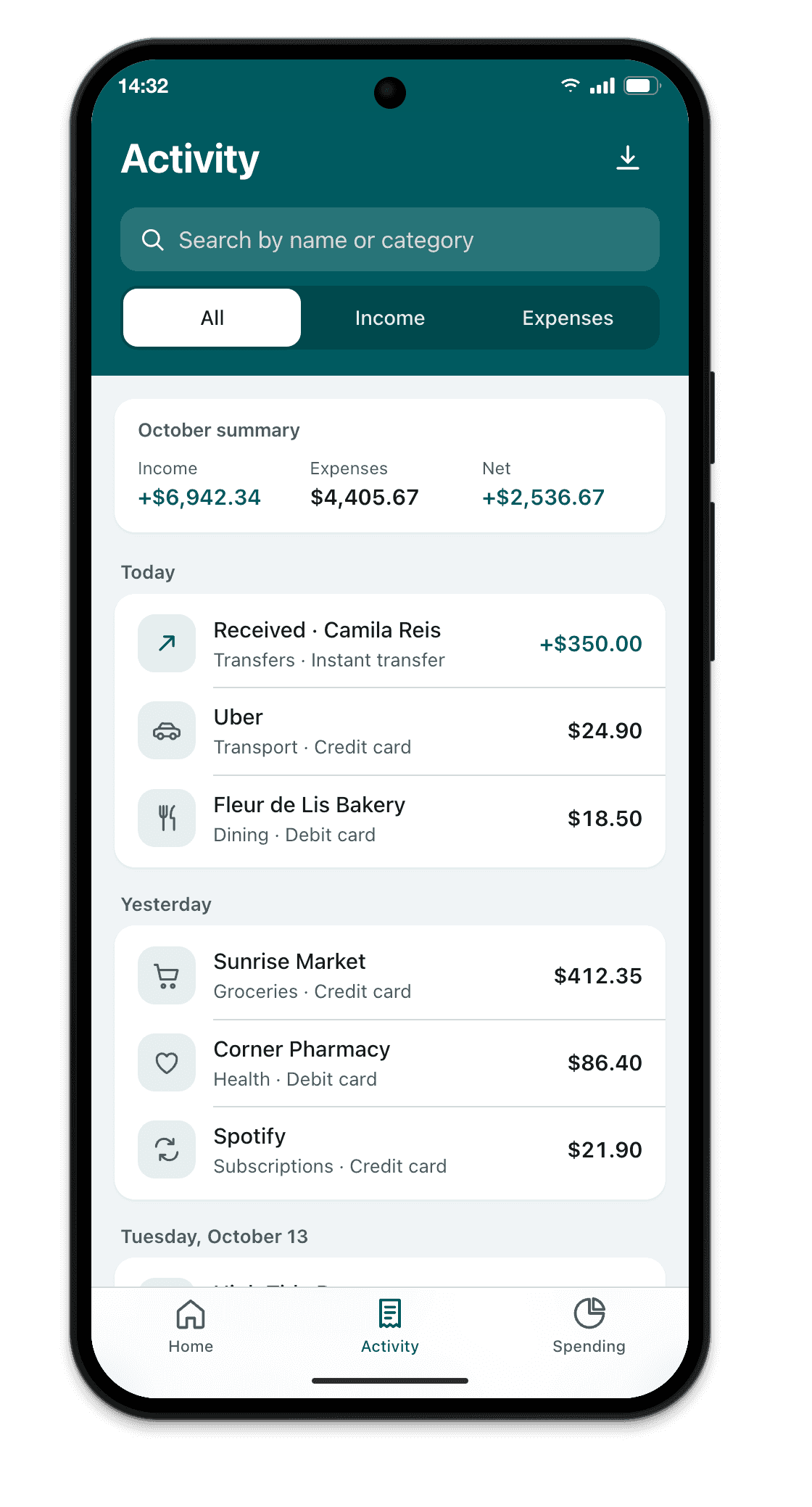
Breakpane is a Mac and Windows app that shows your site or web app inside an iPhone, Android, iPad, laptop or monitor at real dimensions, floating on top of your editor. You save a file and the screen updates.
- Good for: keeping the layout in view the whole time you code, with each model’s frame, status bar, Safari toolbar and safe areas, the installed app (standalone mode, icon, splash and offline) and any custom size. Coding agents like Claude Code or Cursor can also open and test pages on it.
- Stops at: the engine is Chromium. It doesn’t run iOS or Android and won’t reproduce WebKit-only bugs. For those, use the Xcode Simulator or an iPhone.
Which one to use
In practice, almost everyone combines two kinds of tool:
- While you build, something fast and always visible: browser mobile view for occasional checks, or Breakpane to see every save on several devices at once.
- Before you ship, something faithful to the device: the Xcode Simulator or an iPhone for Safari, and the Android Emulator or a real Android phone for Chrome.