Galaxy Z Flip7 viewport size, resolution and safe areas
The Galaxy Z Flip7 has a viewport of 360×840 CSS pixels in portrait (840×360 in landscape), a device pixel ratio (DPR) of 3 and a physical resolution of 1080×2520.
- Portrait
- 360×840
- Landscape
- 840×360
- DPR
- 3
- Physical
- 1080×2520
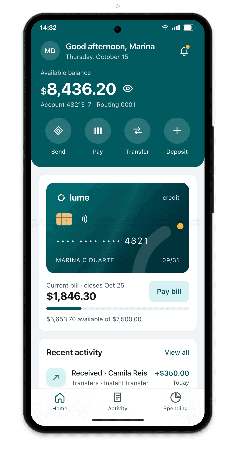
Measurements
| Viewport, portrait | 360×840 |
|---|---|
| Viewport, landscape | 840×360 |
| Device pixel ratio (DPR) | 3 |
| Physical resolution | 1080×2520 |
| Status bar | 32 px |
| Gesture bar | 24 px |
| Chrome: space taken at the top | 88 px |
| Chrome: space taken at the bottom | 24 px |
| Visible viewport in Chrome, portrait | 360×728 |
| OS | Android |
| Note | 6.9″ main screen, folds horizontally |
CSS for the Galaxy Z Flip7
Media query by width
Breakpoints are written in CSS pixels, never in physical resolution.
/* Galaxy Z Flip7: 360 CSS px in portrait, 840 in landscape */
@media (max-width: 360px) {
  /* … */
}

/* screens with a DPR of 3 or more */
@media (min-resolution: 3dppx) {
  /* 3x images */
}
dvh, svh and Chrome's address bar
In Chrome on the Galaxy Z Flip7, the address bar is 56 px tall and collapses as you scroll. 100svh is the height with the bar showing (728 px); 100dvh follows the bar; 100vh is the height with the bar collapsed, taller than what shows when the page opens. With viewport-fit=cover, Chrome on Android 15 and later draws the page under the gesture bar and reports its 24 px in env(safe-area-inset-bottom).
/* Galaxy Z Flip7 in Chrome: 728 px with the bar showing */
.hero { min-height: 100svh; }
.full-screen { height: 100dvh; }
.bottom-bar { padding-bottom: env(safe-area-inset-bottom); }
How Breakpane emulates the Galaxy Z Flip7
Breakpane doesn't run Android. It's Chromium with the Galaxy Z Flip7's viewport (360×840), density (3), user agent, touch, safe areas and display-mode, inside a frame with the real dimensions, floating in front of your editor with your dev server live.
More devices: Android
- Pixel 9412×923 @2.625x
- Pixel 8a412×915 @2.625x
- Pixel 10 Pro XL448×998 @3x
- Pixel 10 Pro Fold (open)755×783 @2.75x
- Galaxy S25360×780 @3x
- Galaxy S24360×780 @3x
- Galaxy S25 Ultra384×832 @2.813x
- Galaxy Z Fold7 (open)750×832 @2.625x
- Galaxy Z Fold7 (closed)412×960 @2.625x
- Galaxy Z Fold5 (open)690×829 @2.625x
- Galaxy Z Fold5 (closed)344×882 @2.625x
- Galaxy Z Flip3360×880 @3x
- Galaxy A06360×800 @2x
- Moto G (2025)412×917 @1.75x
- Redmi Note 13393×873 @2.75x
- Poco X6 Pro407×905 @3x
Measurements from Breakpane's device catalog, checked against public sources (the Chrome DevTools device list, useyourloaf.com, deviceatlas.com, yesviz.com, webmobilefirst.com and 1440px.com) between Oct 2, 2026 and Oct 5, 2026.