Galaxy A06 viewport size, resolution and safe areas
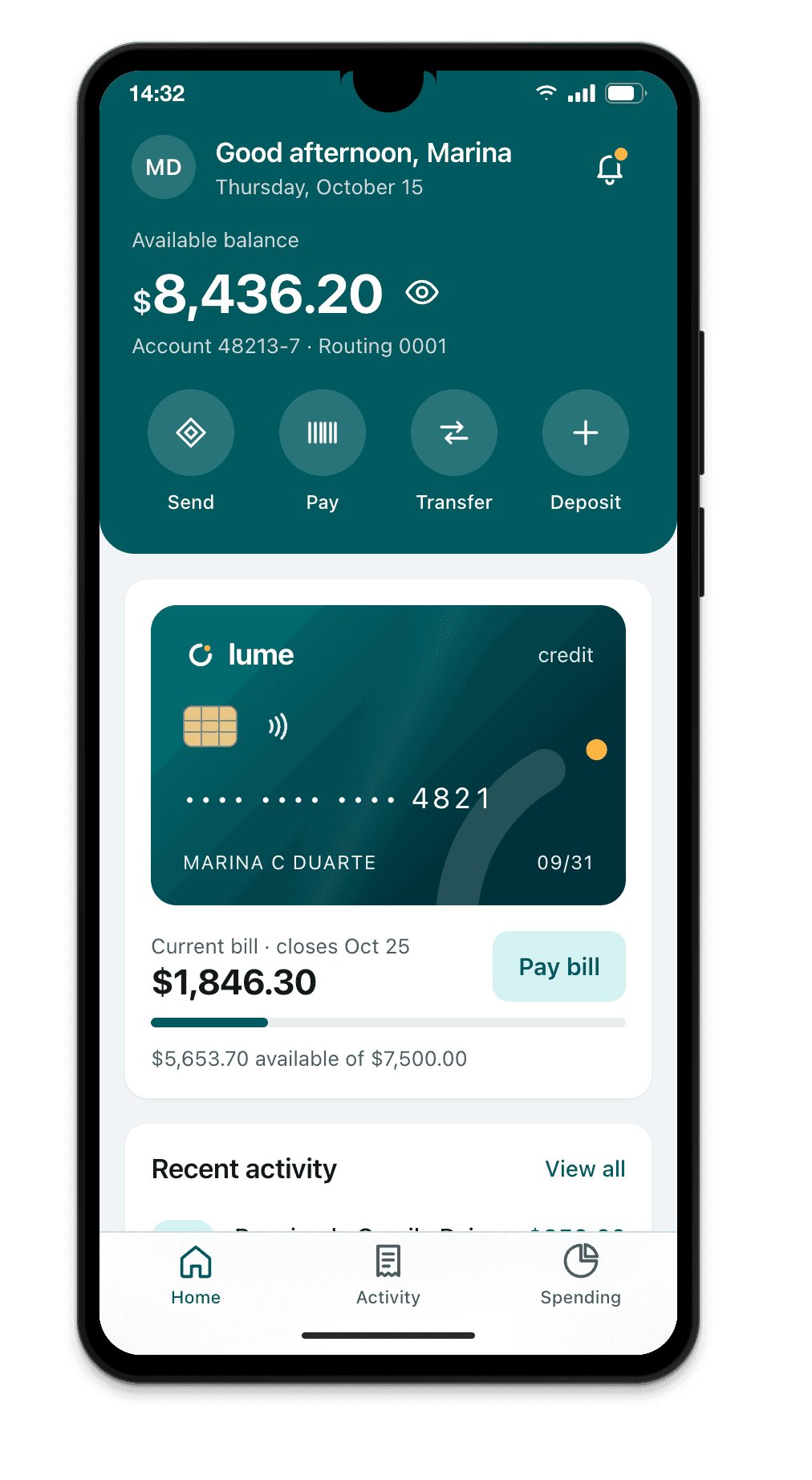
The Galaxy A06 has a viewport of 360×800 CSS pixels in portrait (800×360 in landscape), a device pixel ratio (DPR) of 2 and a physical resolution of 720×1600.
- Portrait
- 360×800
- Landscape
- 800×360
- DPR
- 2
- Physical
- 720×1600
Measurements
| Viewport, portrait | 360×800 |
|---|---|
| Viewport, landscape | 800×360 |
| Device pixel ratio (DPR) | 2 |
| Physical resolution | 720×1600 |
| Status bar | 28 px |
| Gesture bar | 24 px |
| Chrome: space taken at the top | 84 px |
| Chrome: space taken at the bottom | 24 px |
| Visible viewport in Chrome, portrait | 360×692 |
| OS | Android |
| Note | HD+ 720×1600 @2: Brazil's most common viewport (same as A05, A04, M04) |
CSS for the Galaxy A06
Media query by width
Breakpoints are written in CSS pixels, never in physical resolution.
/* Galaxy A06: 360 CSS px in portrait, 800 in landscape */
@media (max-width: 360px) {
  /* … */
}

/* screens with a DPR of 2 or more */
@media (min-resolution: 2dppx) {
  /* 2x images */
}
dvh, svh and Chrome's address bar
In Chrome on the Galaxy A06, the address bar is 56 px tall and collapses as you scroll. 100svh is the height with the bar showing (692 px); 100dvh follows the bar; 100vh is the height with the bar collapsed, taller than what shows when the page opens. With viewport-fit=cover, Chrome on Android 15 and later draws the page under the gesture bar and reports its 24 px in env(safe-area-inset-bottom).
/* Galaxy A06 in Chrome: 692 px with the bar showing */
.hero { min-height: 100svh; }
.full-screen { height: 100dvh; }
.bottom-bar { padding-bottom: env(safe-area-inset-bottom); }
How Breakpane emulates the Galaxy A06
Breakpane doesn't run Android. It's Chromium with the Galaxy A06's viewport (360×800), density (2), user agent, touch, safe areas and display-mode, inside a frame with the real dimensions, floating in front of your editor with your dev server live.
More devices: Android
- Pixel 9412×923 @2.625x
- Pixel 8a412×915 @2.625x
- Pixel 10 Pro XL448×998 @3x
- Pixel 10 Pro Fold (open)755×783 @2.75x
- Galaxy S25360×780 @3x
- Galaxy S24360×780 @3x
- Galaxy S25 Ultra384×832 @2.813x
- Galaxy Z Fold7 (open)750×832 @2.625x
- Galaxy Z Fold7 (closed)412×960 @2.625x
- Galaxy Z Fold5 (open)690×829 @2.625x
- Galaxy Z Fold5 (closed)344×882 @2.625x
- Galaxy Z Flip7360×840 @3x
- Galaxy Z Flip3360×880 @3x
- Moto G (2025)412×917 @1.75x
- Redmi Note 13393×873 @2.75x
- Poco X6 Pro407×905 @3x
Measurements from Breakpane's device catalog, checked against public sources (the Chrome DevTools device list, useyourloaf.com, deviceatlas.com, yesviz.com, webmobilefirst.com and 1440px.com) between Oct 2, 2026 and Oct 5, 2026.