Monitor QHD viewport size and resolution
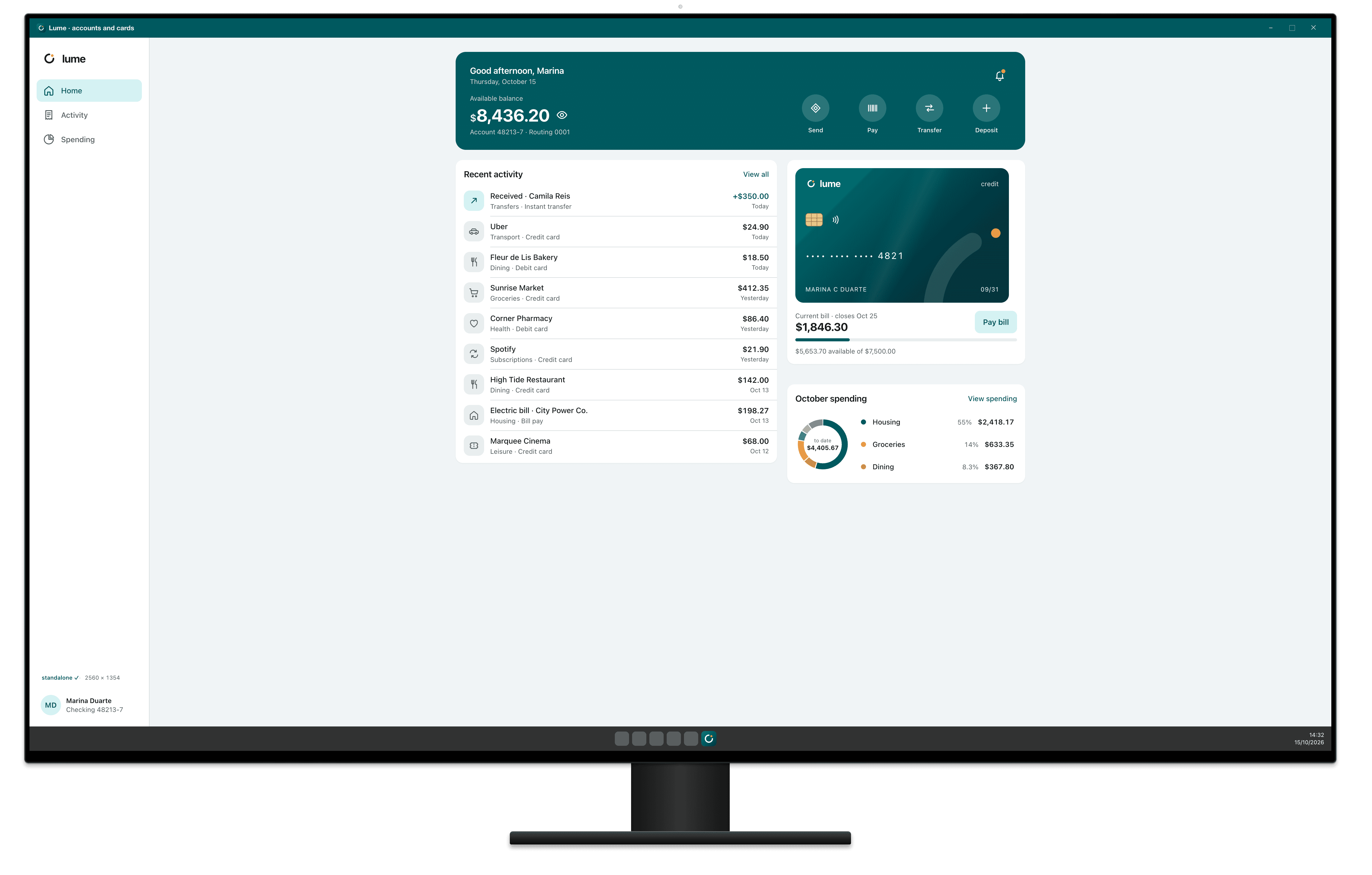
The Monitor QHD has a 2560×1440 CSS pixel screen, a device pixel ratio (DPR) of 1 and a physical resolution of 2560×1440. With Chrome maximized, the page gets 2560×1304.
- Screen
- 2560×1440
- Chrome maximized
- 2560×1304
- DPR
- 1
- Physical
- 2560×1440
Measurements
| Screen | 2560×1440 |
|---|---|
| Device pixel ratio (DPR) | 1 |
| Physical resolution | 2560×1440 |
| Taskbar | 48 px |
| Space left for windows | 2560×1392 |
| Maximized Chrome viewport | 2560×1304 |
| Installed app (PWA) viewport, maximized | 2560×1354 |
| OS | Windows |
| Note | 27″ 2560×1440 with Windows at 100% |
CSS for the Monitor QHD
Media query by width
Breakpoints are written in CSS pixels, never in physical resolution.
/* Monitor QHD: maximized window, 2560 CSS px wide */
@media (max-width: 2560px) {
  /* … */
}
How Breakpane emulates the Monitor QHD
Breakpane opens the Monitor QHD as a 2560×1440 screen with the device's frame, density (1), the user agent of Chrome on Windows and the system bars, floating in front of your editor with your dev server live.
More devices: Desktop
Measurements from Breakpane's device catalog, checked against public sources (the Chrome DevTools device list, useyourloaf.com, deviceatlas.com, yesviz.com, webmobilefirst.com and 1440px.com) between Oct 2, 2026 and Oct 5, 2026.