iPad Pro 13″ viewport size, resolution and safe areas
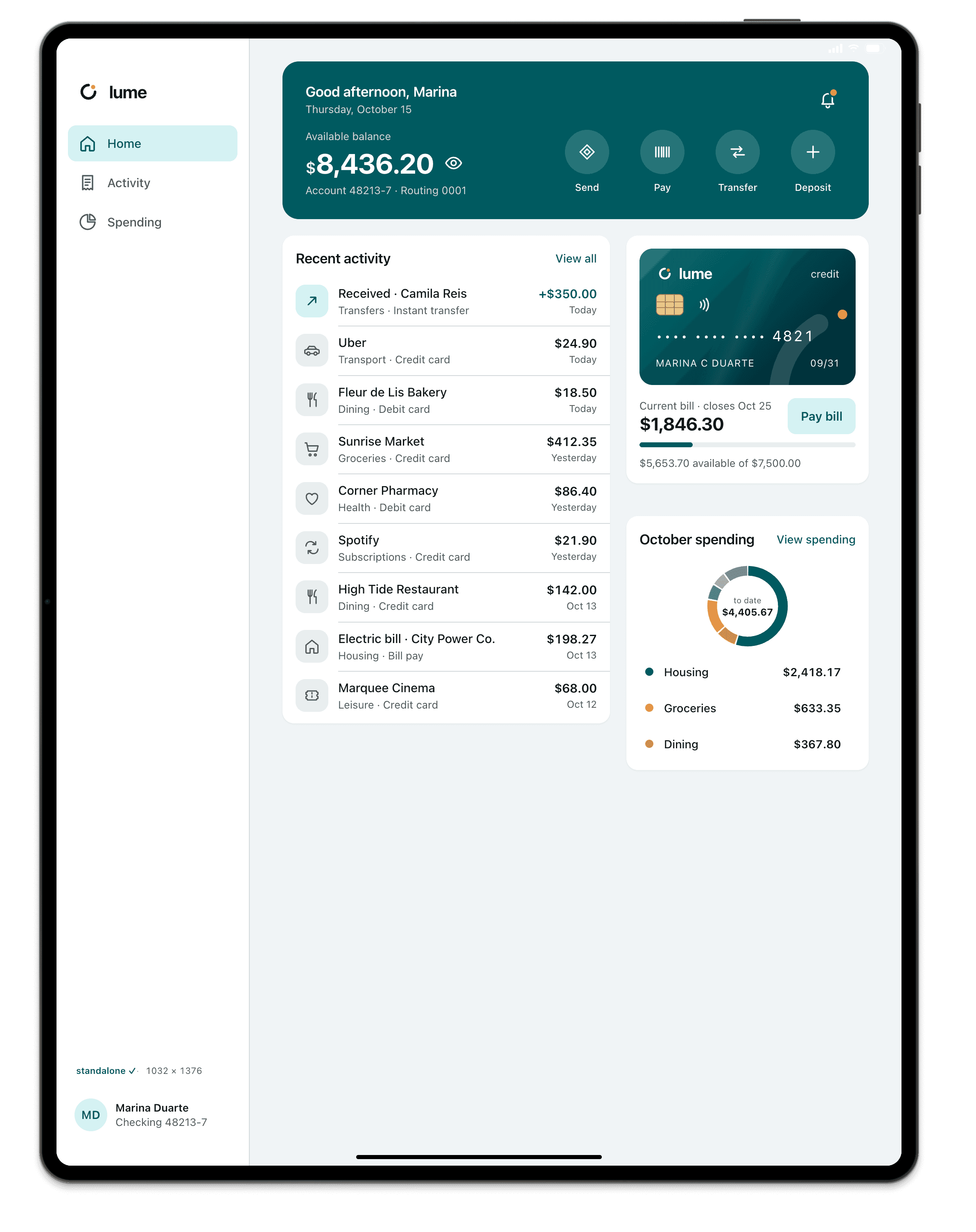
The iPad Pro 13″ has a viewport of 1032×1376 CSS pixels in portrait (1376×1032 in landscape), a device pixel ratio (DPR) of 2 and a physical resolution of 2064×2752.
- Portrait
- 1032×1376
- Landscape
- 1376×1032
- DPR
- 2
- Physical
- 2064×2752
Measurements
| Viewport, portrait | 1032×1376 |
|---|---|
| Viewport, landscape | 1376×1032 |
| Device pixel ratio (DPR) | 2 |
| Physical resolution | 2064×2752 |
| Status bar (top safe area) | 24 px |
| Home indicator (bottom safe area) | 20 px |
| Bottom safe area, landscape | 20 px |
| Safari: space taken at the top | 74 px |
| Visible viewport in Safari, portrait | 1032×1302 |
| OS | iPadOS |
CSS for the iPad Pro 13″
Media query by width
Breakpoints are written in CSS pixels, never in physical resolution.
/* iPad Pro 13″: 1032 CSS px in portrait, 1376 in landscape */
@media (max-width: 1032px) {
  /* … */
}

/* screens with a DPR of 2 or more */
@media (min-resolution: 2dppx) {
  /* 2x images */
}
Safe areas with env()
With viewport-fit=cover, the page runs to the edge and the system hands over the safe areas through env(). In the installed app, the top only becomes an inset with the black-translucent status bar; in Safari, the browser bars cover those strips.
<meta name="viewport" content="width=device-width, initial-scale=1, viewport-fit=cover">
<meta name="apple-mobile-web-app-status-bar-style" content="black-translucent">

/* iPad Pro 13″, portrait: 24 px at the top and 20 px at the bottom */
.header { padding-top: env(safe-area-inset-top); }
.bottom-bar { padding-bottom: env(safe-area-inset-bottom); }
How Breakpane emulates the iPad Pro 13″
Breakpane doesn't run iPadOS. It's Chromium with the iPad Pro 13″'s viewport (1032×1376), density (2), user agent, touch, safe areas and display-mode, inside a frame with the real dimensions, floating in front of your editor with your dev server live.
It covers layout, safe areas and the installed PWA. WebKit rendering or API bugs only show up on a real device or in the Xcode Simulator.
More devices: Tablets
Measurements from Breakpane's device catalog, checked against public sources (the Chrome DevTools device list, useyourloaf.com, deviceatlas.com, yesviz.com, webmobilefirst.com and 1440px.com) between Oct 2, 2026 and Oct 5, 2026.